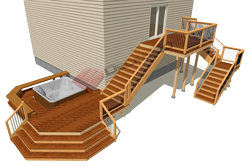
Free Deck Design Lesson
I apologize but this article is long.
It's kind like one complete free deck design lesson all in one. But its also a pretty good reference and covers a lot of ground.
You may wish to print this lesson on deck design for future reference as you start planning your dream deck.
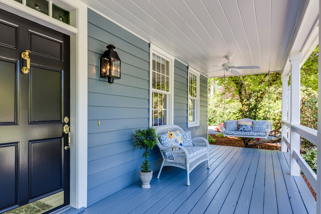
source: unsplash.com

source: unsplash.com
What becomes second nature to someone who has built decks for all kinds of clients for more than 15 years, probably isn't second nature to the beginner deck builder.
So I decided to write this out, rather like a lesson. Enjoy the free tips, and hopefully you will be enlightened a bit after you have read this from start to finish. Just click on the following headings to jump to that section of the article.
What Do You Want From Your Deck?
A deck has the potential to literally be an extension of the living space in your home. Decks expose us and connect us to our immediate environment; an environment that can be as inspiring as the piercing blue sky of an expansive vista, or a majestic mountain backdrop, or as simple and peaceful as a place to sip morning coffee in a backyard surrounded by full summer foliage and a warm breeze.
But more often than not, do-it-yourself deck builders spend zero to little time actually planning their deck design before the first nail is hammered.
And as a result, there are thousands of decks that look like nothing more than an after thought; basically a planked floor randomly attached to house.

source: unsplash.com
Good deck designs can make your deck so much more. In fact with even
just a little bit of time spent learning basic design principles you
will be vastly more pleased with the outcome. You’ll build a deck that
is a seamless continuation of your homes architecture, without the
expensive architectural fees…
To start the deck design process off ask yourself what do you primarily intend to use your deck for? Is it going to be a place for the kids to play? Do you entertain lots of friends and grill outdoors often? Is there a hot tub that you want to incorporate into some part of the deck to create your own backyard spa?
Is it mostly for enjoying the sun or is it to get away from the sun or wind? Do you want to combine some of these elements? Do you want your deck to blend in with the architecture or do you want to want to “import” design elements from another style or era?
Take some time now to answer these questions. It will get you started in the right direction before you turn your mind to the next topic – how to work with your site.
Work With The Surrounding Architecture and Landscape
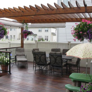
Take a good look around your neighborhood. If the homes are all of a similar era or architectural style you may find that if your deck were to depart too radically from let’s say, the colonial or arts & craft appearance, it may actually detract from your home. Some decks just look better with a white colonial railing while others look perfectly fine with natural cedar or redwood.
Organic and Imported Designs
Designs that build off or seem to naturally compliment the site or architecture are often called “organic” whereas the alternative is an “imported” design such as a southwest style deck on a Cape Cod beach house - if you can imagine that. Not too appealing…
But if you import subtle characteristics, such as hints of color or materials from another style you are more likely to successfully fuse the two. But if this is your first deck you are building, you would probably be best to stick with more organic designs.
Formal and Informal Designs
Keeping your surroundings in mind, consider whether your deck would look better and fit in more if it were more formal by using symmetrical shapes like squares or rectangles or traditional details in the trim or railings. Or would a more informal deck design using curves or asymmetrical shapes accent your home better.
Maybe so, if you are in a natural cabin or cottage environment. But don’t throw in curves just to show off your carpentry skills. If you are going to be more artistic and adventurous do it so that there is some balance or a sense of purpose.
Basic Site Design
Once you have considered the following issues, it will be very easy to determine where you would like to locate your deck. Or maybe you have such a limited area to work with that there is really only one possible place for your deck. Whatever the case, consider the following issues so you can optimize your design.
Physical Obstacles or Attributes
Look at your site and take note of the physical objects that you will have to design around. These will include things such as doors and window locations along your house, drainage areas or downspouts, underground utilities such as electricity, gas, phone or cable, electrical outlets and hose bibs. Don’t forget to know the setback distances if your deck will be encroaching a property line.
But also note the positive attributes that can really give you a great opportunity to design your deck to compliment such things as trees, gardens, large rocks or slopes.
Topography
Take a good look at the elevation of your building site. A flat site will obviously give you different design options than a steeply sloped site. But whether the land is flat or sloped you should take advantage of it by working it into your deck design somehow.
Slopes can offer a great opportunity to take advantage of views or introduce different levels or zones. Although it can be a challenge to create separate areas with large elevation changes that actually feel connected.
What often happens is that the lower deck level looks and feels like a bit of an orphan. (talk about the krker job as way around this problem). You can successfully overcome this problem by giving a lower deck an identity of its own by creating an obvious purpose like a hot tub area, a cooking zone or a sunning area.

source: unsplash.com
Climate and Exposure
Make sure you know your directions. Take note of where the north, south, east and west elevations are and be aware of the sun’s path and height in the sky during the summer months when you will use your deck most.
Depending on your climate you may choose to position your deck to take advantage of maximum sun exposure or maximum shade during midday. Maybe it doesn’t matter to you but take a moment to think about it.
Also consider any prevailing winds that may affect your deck or any open exposed views to other neighbors or high traffic zones if this is relevant. You may choose to build a wind or privacy screen for your deck if desired.
Design Techniques
Now that you have thoroughly examined the site and surroundings of your deck, it’s time to start the actual design process. Design is mostly an art but still relies on some basic rules of thumb.
You don’t have to rigidly adhere to any of these rules but by being aware of them the result will inevitably be a deck design that scores well for both form and function.
Creating Separate Areas on a Deck
Try to think of the areas or centers on your deck where people may gather. If you deck is very small, this is not really a consideration because space is at a premium. But it matters when you start designing a larger deck.
Are there any social activities you envision and would like to accommodate on your deck? Usually an eating area is common, but what about a quiet area away from foot traffic where you can read or relax in the sun?
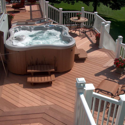
Hot tubs are a great addition when built into a deck and can be a separate center itself.
Nodes
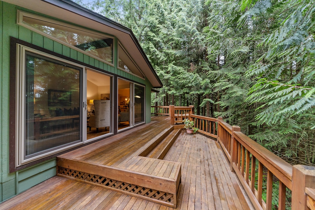
Nodes are like mini centers and take up less space. An area where you have your barbeque grill and cooking equipment might be a node. It can be positioned in a smaller area than a center but still should not be directly in line with an established or frequently used foot traffic area if possible. Built-in benches can have the effect of creating nodes as well if the deck is all one level.
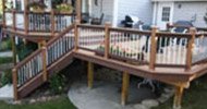
Level changes of 6” or 7” are excellent at defining breaks in spaces. Contrasts in the direction of decking boards or perpendicular perimeter decking can emphasize an elevation change.
By then end of this exercise you should have a clear idea in your mind of the different areas on your deck and what their purpose is. If you can’t define what their purpose is, chances are you are building an area that will become useless space.
source: unsplash.com
Stairs, Doors and Foot Traffic
Now that you have defined the different spaces on your deck you will have to consider things such as doors, stairs, windows and foot traffic.
Where your deck is located in relation to the most popular areas on the inside of your house determines how much it will be used. A deck that is off of a master bedroom and is only accessible from the bedroom will become a rather private space.
You wouldn’t expect to invite your friends over for a barbeque on this deck as they would have to traipse through your bedroom each time.
Whereas a deck that is off the kitchen area is a natural extension for an outdoor eating and socializing area. But will all of the traffic through that patio door, be sure to set the eating area and cooking area (centers and nodes) away from the direct line of traffic.
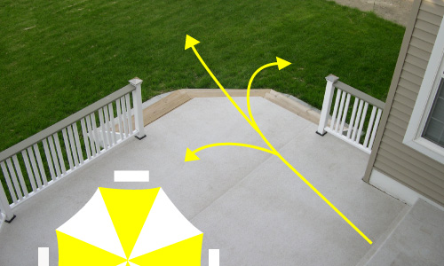
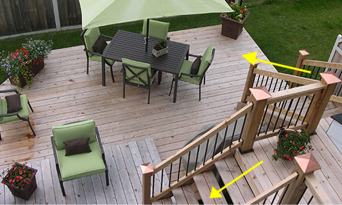
Where you locate a frequently used set of stairs will determine the traffic flow. Think of the main exit of the house and the main exit from the deck (typically stairs) as points, which are to be joined by lines. You will quickly see how traffic will tend to flow.
With that in mind, reassess your deck design to see if your quiet reading area or hot tub area will be right in the way of a common traffic zone.
Remember people like to take the shortest route possible so if traffic must cross the deck try to make sure it doesn’t cross directly through an area you would like to be more tranquil. Try instead to make the obvious traffic route follow along the perimeters of the deck wherever possible.
Transition zones from one center to another don’t have to be very big. In fact 4’ or 5’ width is usually enough to create an obvious pathway signaling to people that its not really a place to congregate. The destination zone at the end would be more inviting.
You will see how people naturally prefer to gather in areas that have focal points rather than narrow walkways. Use this to your advantage when designing your deck.
Try to avoid having a railing meet the wall of the house right in front of a window. It will never look good. Instead stop the deck before or after the window.
Keep these free deck design tips in mind as they are the foundation that you will build your design from. Now you can start thinking about the finer more artistic aspects of your deck.
Architectural Issues
A good design must take into consideration the existing architecture. If you completely ignore it, you will end up with what you typically see on many homes – a deck that looks like an afterthought with no particular sense of belonging.
So if you have a traditional New England style home you will probably be looking at using fairly traditional styles and white color.
Contrasts and Continuity
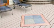
Just because you may be confined with an existing architectural style doesn’t mean you can’t find and use contrast to heighten the senses. Contrast can be achieved through the use of color, material changes in deck flooring, deck railing, posts or deck stairs.
Contrasts can be achieved by creating different sized areas on the deck such as a large open area and then a smaller isolated nook with benches or chairs rather than one big massive expanse of deck.
Glass or aluminum railings can contrast with a cedar deck floor. Stair treads and deck boards can be a different color than the fascia boards and stair stringers. Or the top rail of the deck railing can be a copper color while the posts and balusters remain white.
You get the idea. Tasteful contrasts create subtle and attractive differences for the eye and subliminally “sell us” on the beauty of a deck. As a result it looks better, is used more frequently and adds more value to your home.
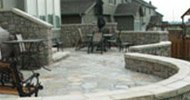
Contrasts can be changes in materials, iron pickets, wood posts, stone work around the deck against wood, or different colors, stucco rail panels against a wood floor, connect two small decks with interlock brick path, change decking pattern to contract levels.
Continuity simply refers to stylistic sense between the deck and the house and surroundings. If you recall the earlier discussion on organic and imported designs, its really the same thing.
Ask yourself if what you are designing actually makes sense. Ask another person for their unbiased opinion. They will often pick up on things right away that you over looked because you are so immersed in the process.
Shape
The shape of a deck can sometimes improve its functionality and also change the look of a house. A deck placed in the middle of a long one-storey rancher can make the home look a little narrower.
Similarly a deck with noticeable horizontal lines can make a taller house seem less so. Corners cut at 45 degrees can create visual interest when not done excessively.
But sometimes simplicity in design says more than trying to overdo something or else the deck just becomes too busy – too many focal points - too many distractions.
Size and Cost
No residential deck ever needs to be more than about 14’ wide. In fact 12’ is usually a good maximum to use. Beyond those numbers and the deck begins to take away from its usefulness when you consider that 4 people sitting around a table don’t need any more than a 12”x12’ area.
There is a relationship between the size of a deck and cost but its not always directly proportional. There is a little leeway. If you keep in mind that most of the cost of building a deck is in the labor for preparing the footings, posts and beams.
By keeping the same number of posts and beam length you can move the posts and beam further out from the house and cantilever the deck structure a bit more without increasing your costs. You will have to increase the size of the joists and space them a bit closer but you still are saving money.
Running the deck boards perpendicular to the house will increase your material cost because the joists have to be run parallel and then beams perpendicular.
Beams mounted perpendicularly to a home are more challenging to attach and this will increase your labor and likely the number of posts you require. But maybe the cost is worth the final look for what you have in mind.
Re-working Your Deck Design
Having just been inundated with all of these free deck design tips and techniques its time to start drawing up the first of several deck designs.
Start with a plan view of the lot and the house will all windows and doors, electrical outlets, hose bibs, gas outlets, trees, rocks and any other physical markers. Note the slope to or from the house with arrows and include the North direction.
Draw several different versions of your deck shape playing with the location of stairs, and the different zones. Note any level changes. Show the direction of the deck boards and use arrows linking entry and exit points of the deck to indicate expected traffic flow.
This is where some good deck design or layout software really comes in handy. Some of the software we have found includes calculators for stairs, joist spans, beam spans and deck load specifications.
They also tell you how big your beams and joists should be to support the weights you anticipate. And then prints out the material lists for you. Check them out.
By the third or fourth drawing you should be very close to your final design.
Well, you’ve covered a lot. But you are now armed with all the basics on deck design.
Now Go Design Your Own Deck!
Use this free deck design lesson to give you some inspirational ideas for great deck designs of your own. Just a little bit of know how (which you now have) and your own creativity is all it takes to build a wood deck that tastefully stands out from the rest of your neighbors.
Home > Planning & Design > Free Deck Design
